So with making a quilt in mind, I had bought 1 meter of 6 different, coordinating fabrics. Since some of these fabrics are pretty large scale, I wanted to do a simple quilt pattern that would allow you to see the fabrics. Well playing around with Microsoft Photo Editor and Powerpoint (my computer is having trouble running Photoshop) here is what I got.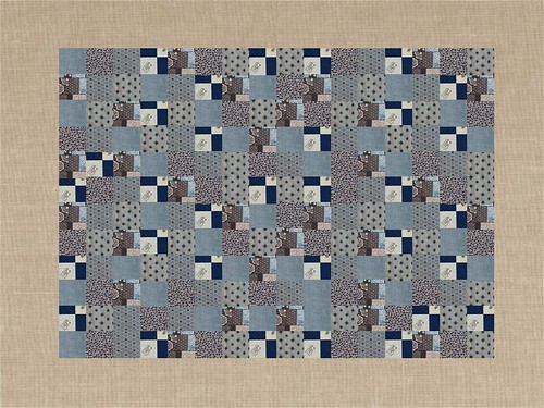
We'll call this #1. Based on one of Maritza's doll quilts
#2 - Loosely based on the Half Moon Bay quilt I did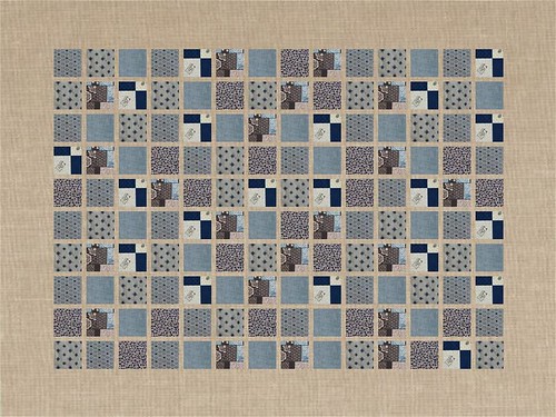
#3 - Who doesn't like squares and linen? I guess like looks like another one of Maritza's too!
#4 - similar pattern found here by googling "simple japanese quilt". Actually, I like their original pattern quilt a bit...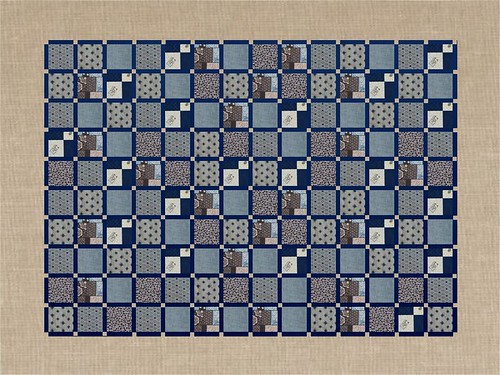
#5 added on after I added the link for #4
So what do you think?
Thursday, September 6, 2007
Simple Quilts are so hard!!
Posted by Unknown at 7:56 PM
Labels: fabric love, japan, Quilting, WIP
Subscribe to:
Post Comments (Atom)




16 comments:
So hard to choose! I like #3, #4, and #5. I like the simplicity of 3, a very clean look.
I vote for 5!
#2 I choose you!
I like #3. #5, too, even though my eye is having a hard time resting on it.
I like #2. The black squares give the quilt a little pop while the beige gives a place for the eye to rest.
Wow, they're all so beautiful. I admire your patience in doing this. Hmmm....I like the contrasts that come to play in No. 5
They are all nice, but I vote for the simplest of them all, #1.
How lovely to play with the different design concepts--but it would make me so wishy-washy about settling on a choice, I'd never get the quilt actually made. However, I've managed to contain myself and offer you my vote: #5.
I'm a huge fan of Maritza's work, so this may be biased, but the two that caught my eye were #1 and #3.
They are all very nice, but I find #3 the most soothing.
Number 2!!
#3 or #5, although I think they all look pretty good!
I am so not observant. I kept looking at how the squares were organized rather than the background.
I like #3 for mellow and #4 for striking.
Wowie! They are all very pretty! Good luck.
i vote for 4!
So hard to choose - I like the last one best...
Post a Comment